How to Style Your Brand Part 2: Finding your focus / Fiona Humberstone
.
4
min read
Branding design is a bit of an art, but with these insightful tutorials from brand stylist (and Hiscox customer) Fiona Humberstone, you’ll master yours in no time. Here’s part 2 in the series.
Intention is the difference between a brand that opens doors for you and one that constantly feels like you’re wading through treacle. By taking the time to focus on what you want to be known for, you can then make objective decisions that will help move your business forwards.
Fonts, colours
, patterns, textures, even photography styles and shapes, all communicate a certain meaning. If you understand a little about what they communicate subconsciously, you can make sure that your business is communicating in a coherent, compelling and intentional way. We'll come back to this next week.
“It’s not hard to make decisions once you know what your values are.” Roy E Disney
I love this quote because it highlights so simply what many of us overlook: that by taking the time to get focused at the outset we will find things much easier further down the line.
If you know you want to come across as creative, quirky and fun, for example, there are fonts, colours and illustrative styles that you can use to communicate that.
Essentially, you need to ask yourself: what do I want to be known for? What makes you different? What do your clients love about what you do and how do you want to come across?
Just take a moment or two to write down three words that encapsulate how you’d like your business to be seen. Three words that sum up what you want to be known for.
Planning Workbook
There’s a Planning Workbook (external link) on my blog which is available to download for free. Inside it you’ll find all the questions you need to find a clear focus and brand your business effectively.
Let’s take a look at how a couple of different businesses have used their understanding of what makes them unique and channelled that into a very clear and compelling proposition.
The Future Kept
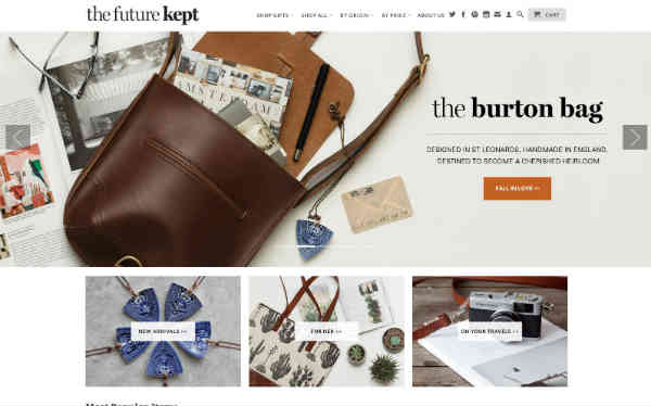
I love the Future Kept. They’re in my new book and I love the way they are so clear about what their brand is all about.
It’s a very simple brand identity: a colour palette based around black and white, simple typefaces and a large emphasis on great photography but it works so well.
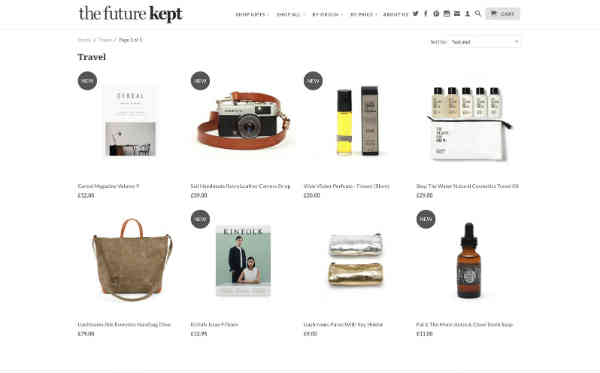
They’ve used their focus to curate what they sell in their shop, which makes the brand even more irresistible to the people that love their approach.
They aren’t trying to be all things to everyone, they are just focused on their target client and what they do best.
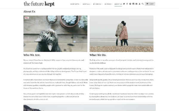
Take a look at their about page: even their photography and tone of voice reflects their brand values. It’s a really well thought through, well-executed brand.
Now for a complete contrast, let’s look at something equally well focused and confident but with a totally different look.
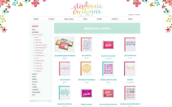
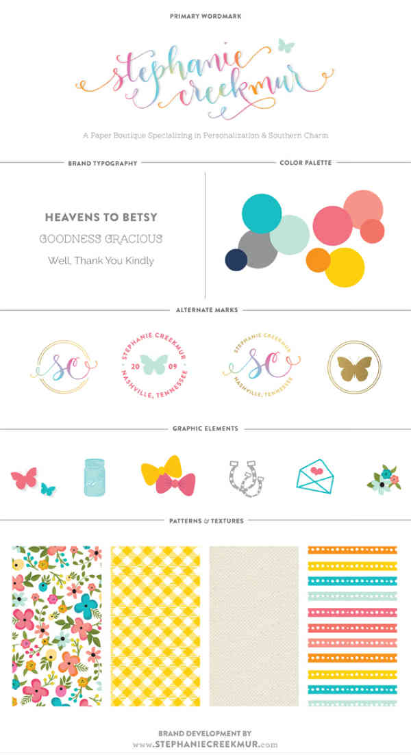
Stephanie Creekmur
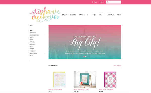
I love Stephanie Creekmur’s happy, warm and vivacious approach to her business. Her passion and personality shine through and her brand identity perfectly reflects what her company is all about.
Stephanie’s about page couldn’t be more different to The Future Kept, and that’s exactly why it works.
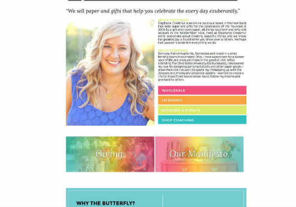
Stephanie’s distinctive creative style and strong tone of voice makes it a very compelling proposition for her ideal client and I think that’s one big lesson we can take away.
Sticking your head above the parapet
It’s scary to stick your head above the parapet and create a strong, standout brand, but it’s essential. It’s so tempting to water things down, to try and appeal to everyone and keep things safe, but the problem with that is that you’ll appeal to no one.
Both the examples I’ve shown you will be utterly compelling to the right target markets. They won’t appeal to everyone, but nothing does, what they will do is be infinitely more successful than the bland, safe brands.
This week, take a little time to work through your intention. Ask yourself, what do I want to be known for? And do download the Planning Workbook – it’s free and there’s some good stuff in there.
Next week we’ll look at how you can translate your focus into fonts, colours, textures and patterns that send out the right signals.
Fiona Humberstone is a Hiscox business insurance customer. To find out about business insurance you might need, you can go directly to the Hiscox Business Insurance page and receive a quote, or if you’re still researching, check out our What is Business Insurance guide.
How to style your brand Part 1: The absolute essentials
How to style your brand Part 3: Colour psychology – your secret weapon
How to style your brand Part 4: Creating a compelling vision
Disclaimer:
At Hiscox, we want to help your small business thrive. Our blog has many articles you may find relevant and useful as your business grows. But these articles aren’t professional advice. So, to find out more on a subject we cover here, please seek professional assistance.